KUMBRA – Identyfikacja wizualna festiwalu literackiego
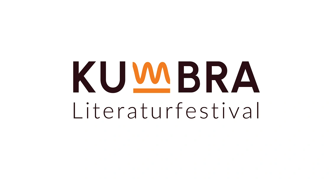
The visual identity for KUMBRA Literaturfestival was created with a modern cultural event in mind—one that merges literature with the vibrant energy of urban life. The festival name is presented in a distinctive logotype, where the letter “W” is transformed into a dynamic, flowing symbol reminiscent of an open book or the rhythmic flow of storytelling. The warm color palette—featuring shades of orange, purple, and deep brown—gives the design a striking character that captures attention while maintaining the elegance appropriate for a cultural event. The scope of the project included: the logotype and its color variations; a visual identity system applied across multiple formats: posters, banners, tote bags, lanyards, event flags; and the development of a unique graphic motif (the wave in the “W”), which also serves as a decorative element in promotional materials. The design was developed with a focus on consistent visual communication and easy adaptability across different formats—from outdoor media to festival merchandise.
KUMBRA is a festival that celebrates literature in a contemporary, open, and engaging context.