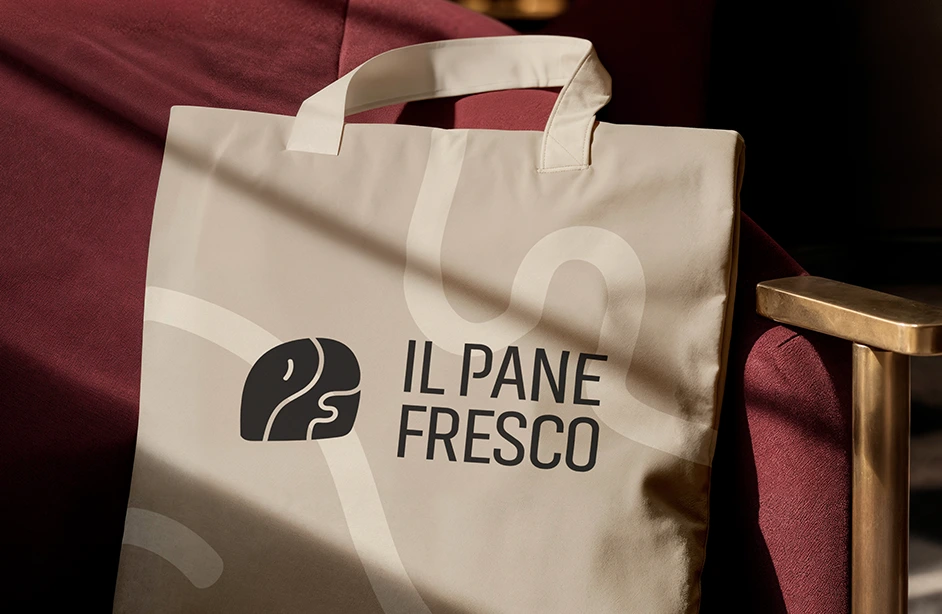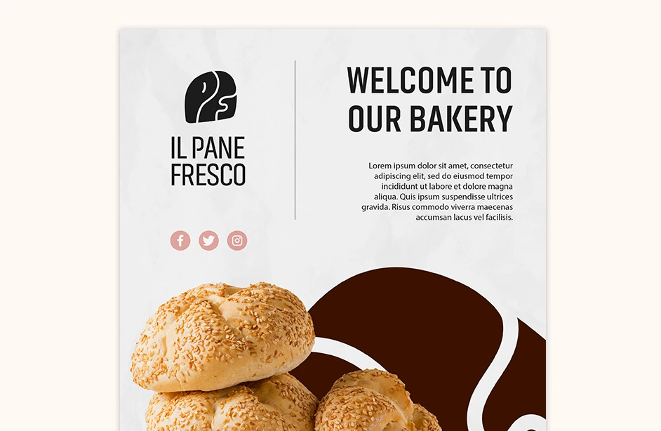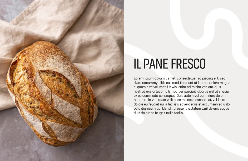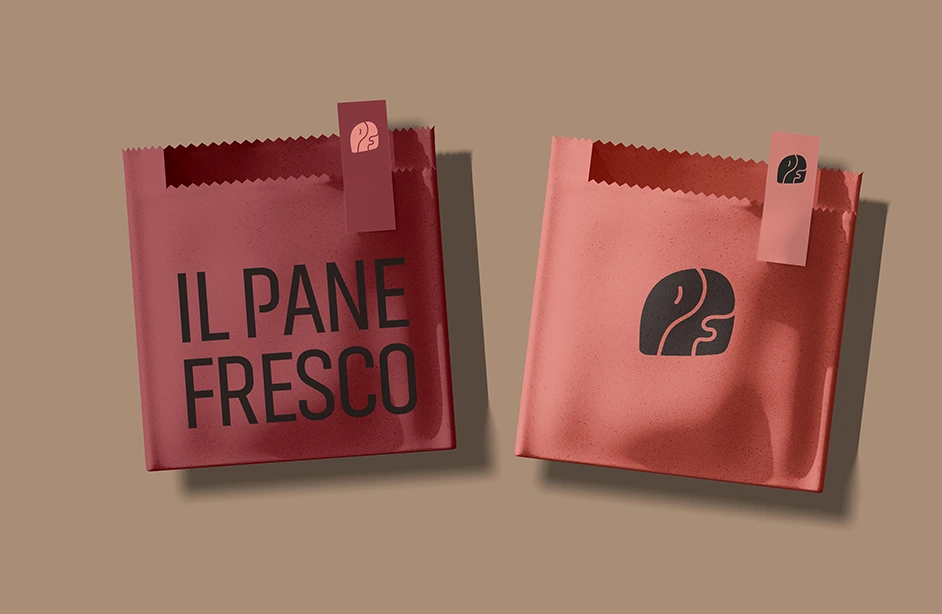
Il Pane Fresco – visual identity for a craft bakery
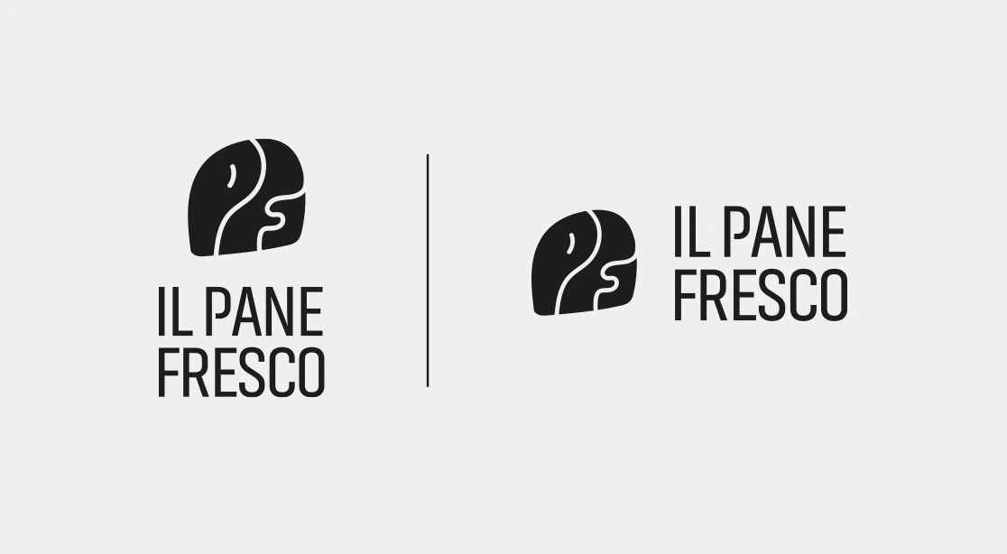
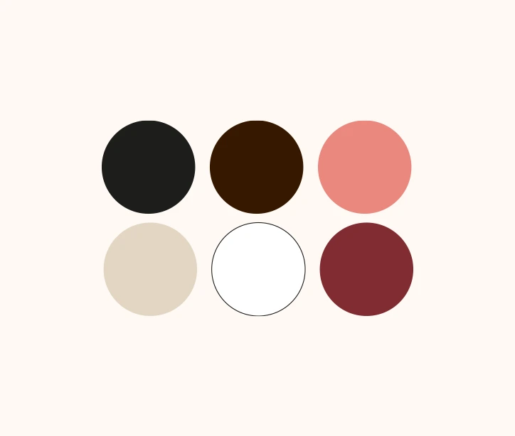
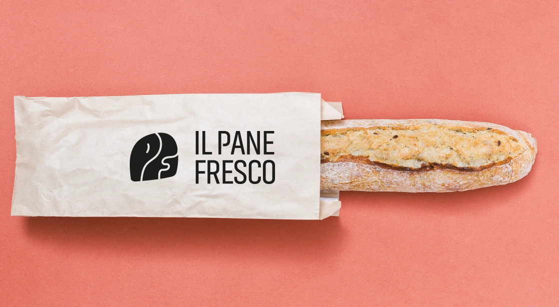
The visual identity project for Il Pane Fresco, a craft bakery, combines artisanal authenticity with a modern approach to branding. The brand’s logo is based on the abbreviation “IPF” and draws inspiration from soft, organic shapes reminiscent of the texture of sliced bread — with its porous, irregular structure. The color palette is built around warm, natural tones: flour beiges, deep browns of baked crust, soft creams, and muted pinks. Each shade was carefully selected to evoke the atmosphere of fresh baking and high-quality, handmade craftsmanship. The typography is minimal and elegant, supporting a cohesive and clear visual message. The goal was to create a brand that not only appeals visually but also builds trust in the quality and authenticity of the bakery’s products.