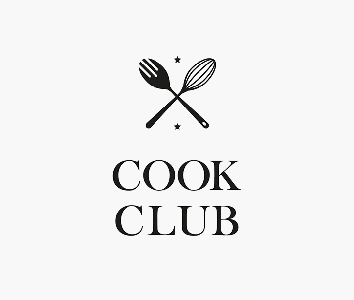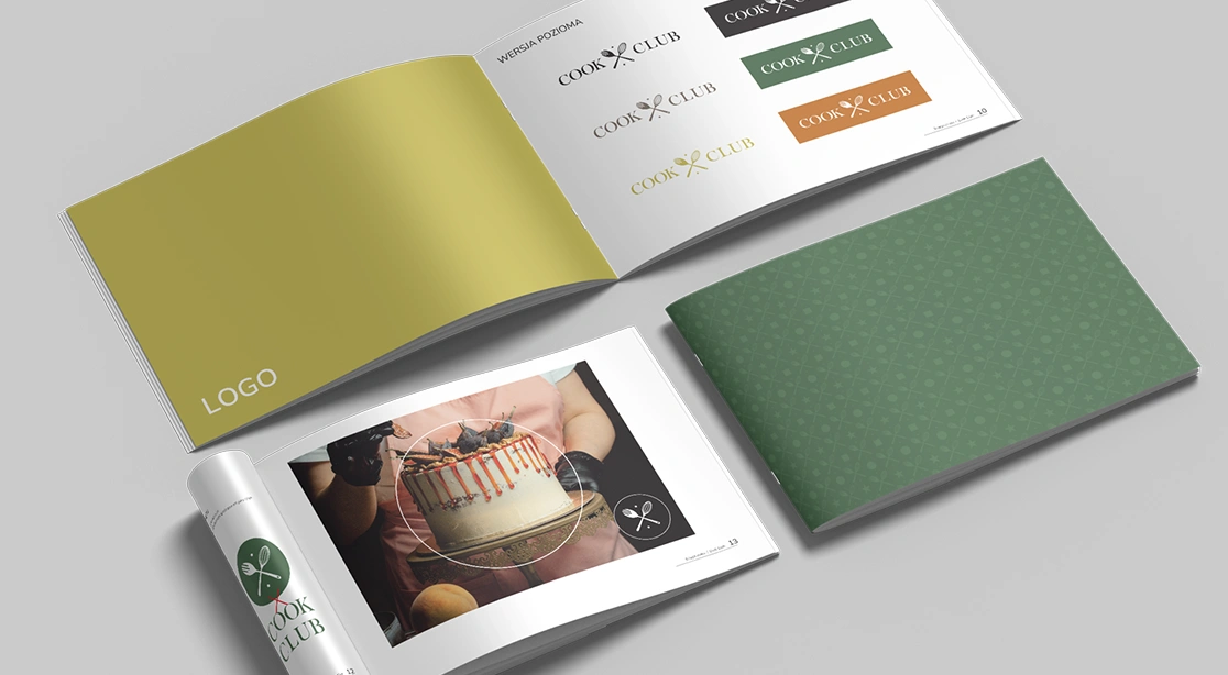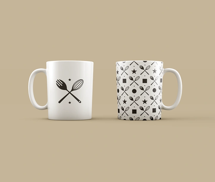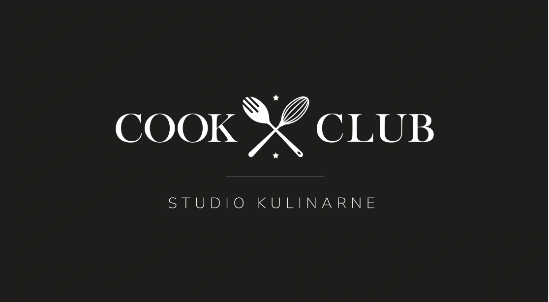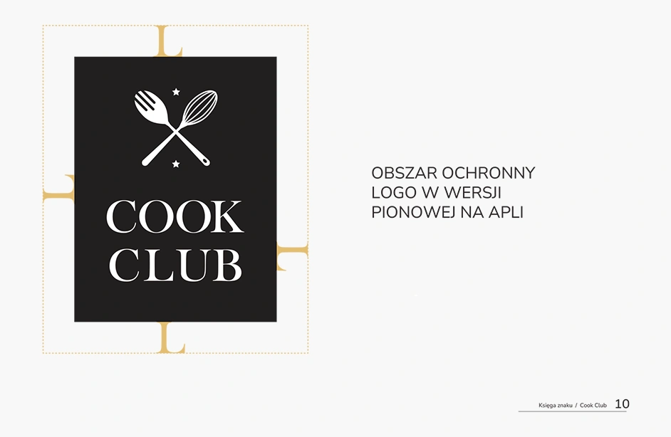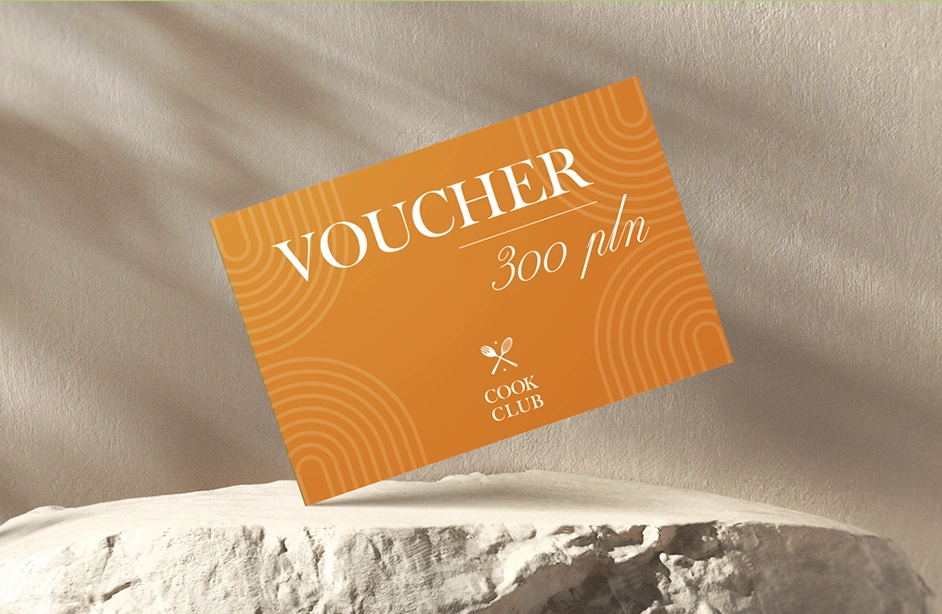
Cook Club – Visual Identity
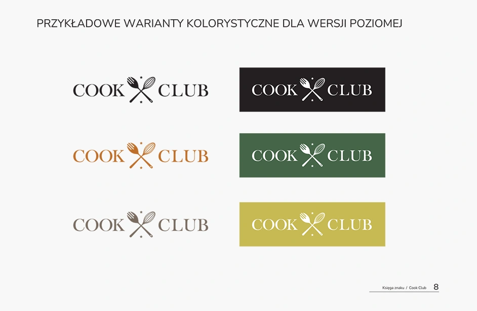
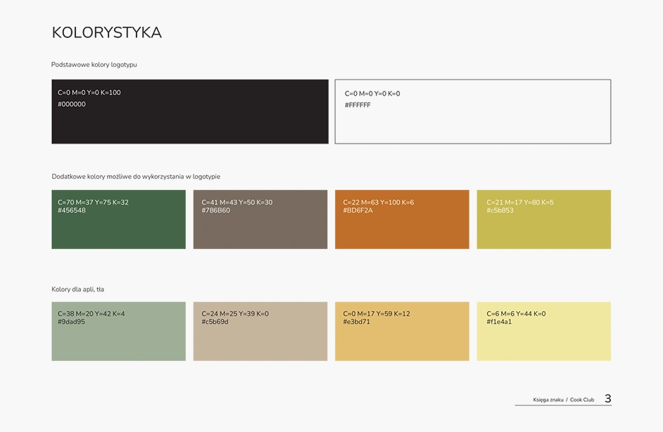
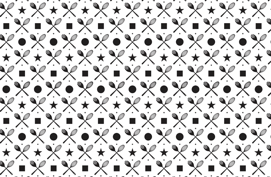
The visual identity project for the Cook Club brand was inspired by emblems of traditional sports clubs – such as tennis or golf clubs. The main objective was to create an elegant and timeless image that evokes professionalism, high quality, and a passion for culinary arts. The logo is based on the motif of crossed kitchen tools – a whisk and a spoon – symbolizing community, dedication, and the prestige of club membership. The typography used is a classic serif typeface that emphasizes tradition and refinement.The scope of the project included: the main logo and its variations (light and dark); a brand book with guidelines on logo construction, color palette, and usage examples; visualizations on promotional materials such as mugs, covers, and catalogs. The color palette is built on muted, natural tones – black, white, beige, and green – creating an atmosphere of calm, elegance, and trust. This project was designed for a brand that promotes culinary education, personal passion, and community building. Cook Club is not just a place – it’s a lifestyle.