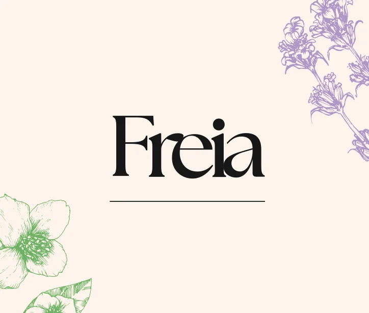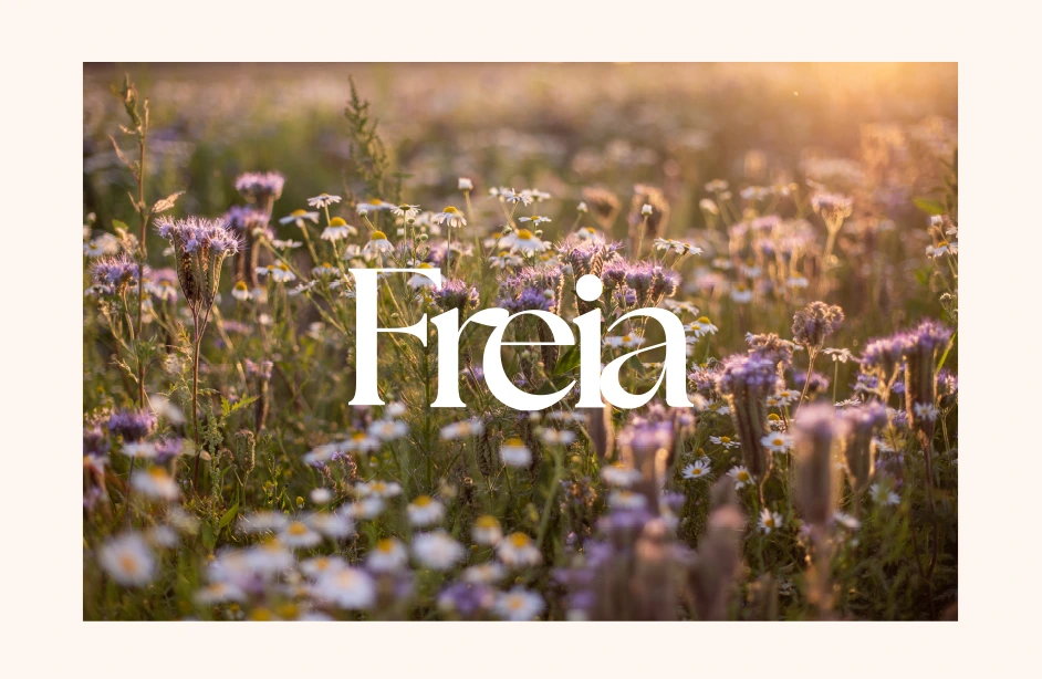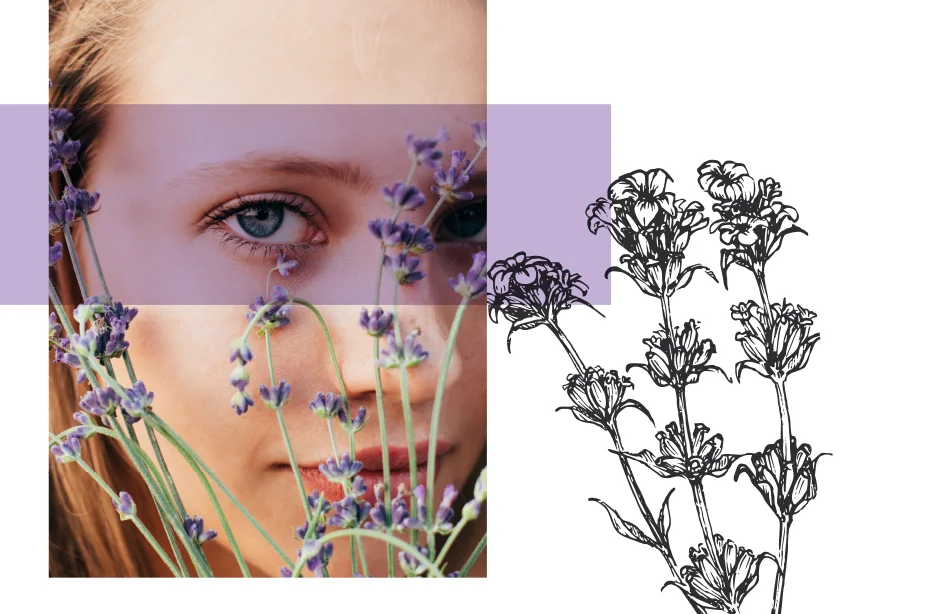
Freia
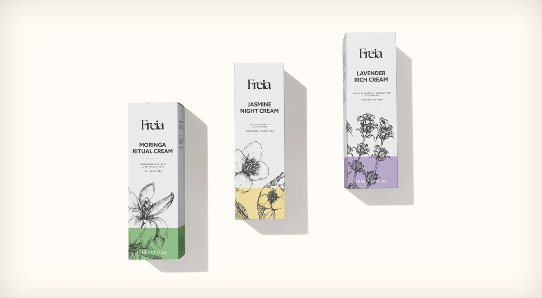
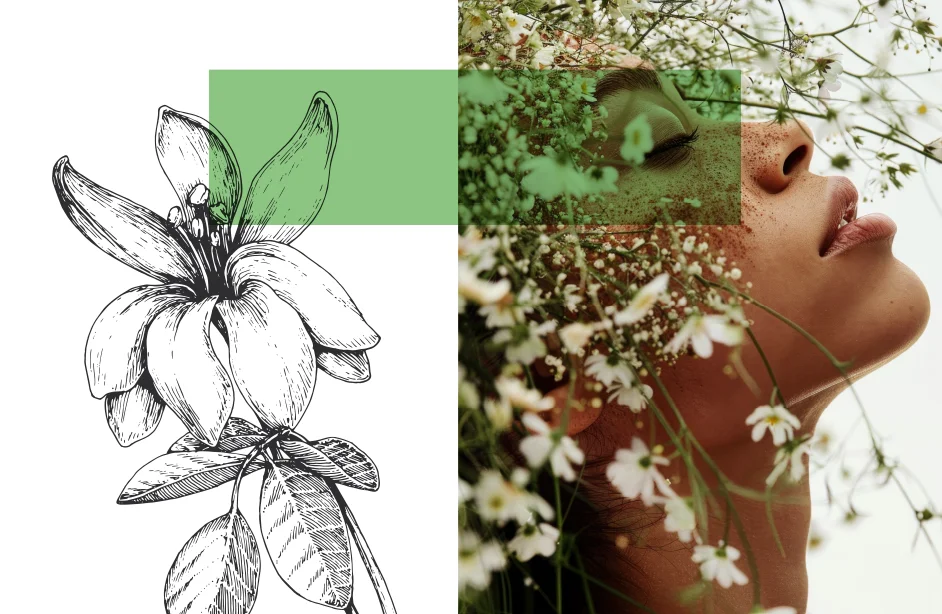
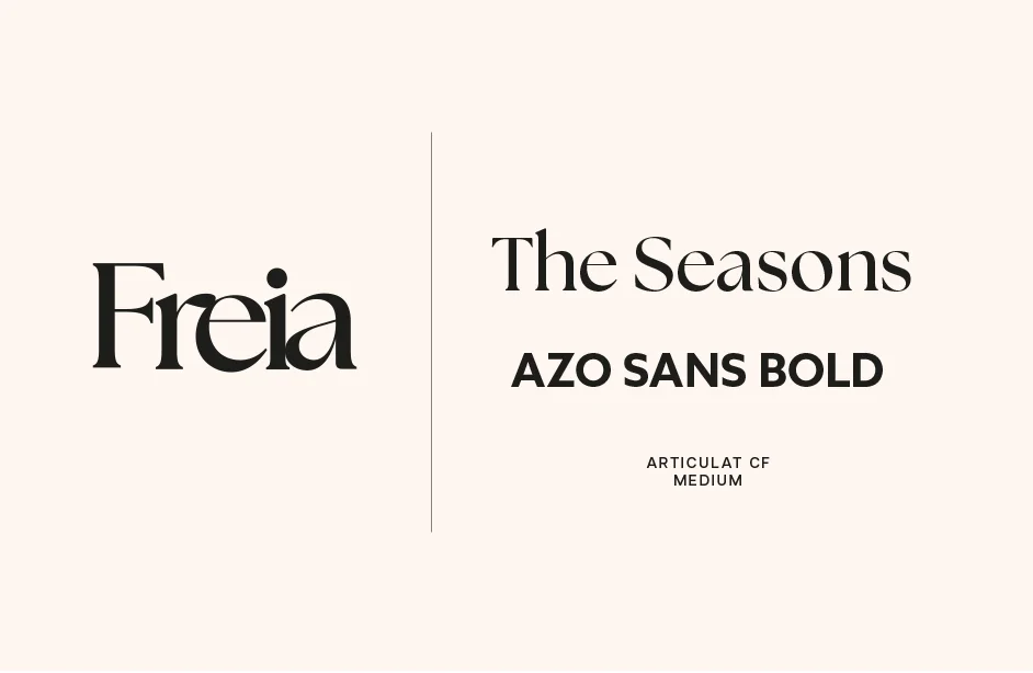
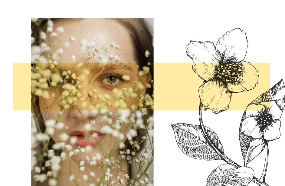
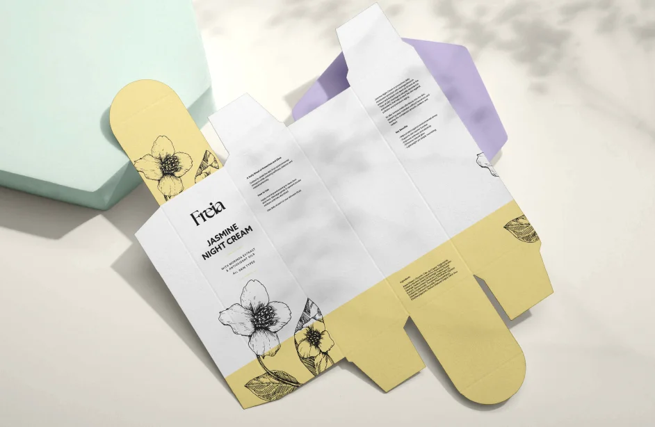
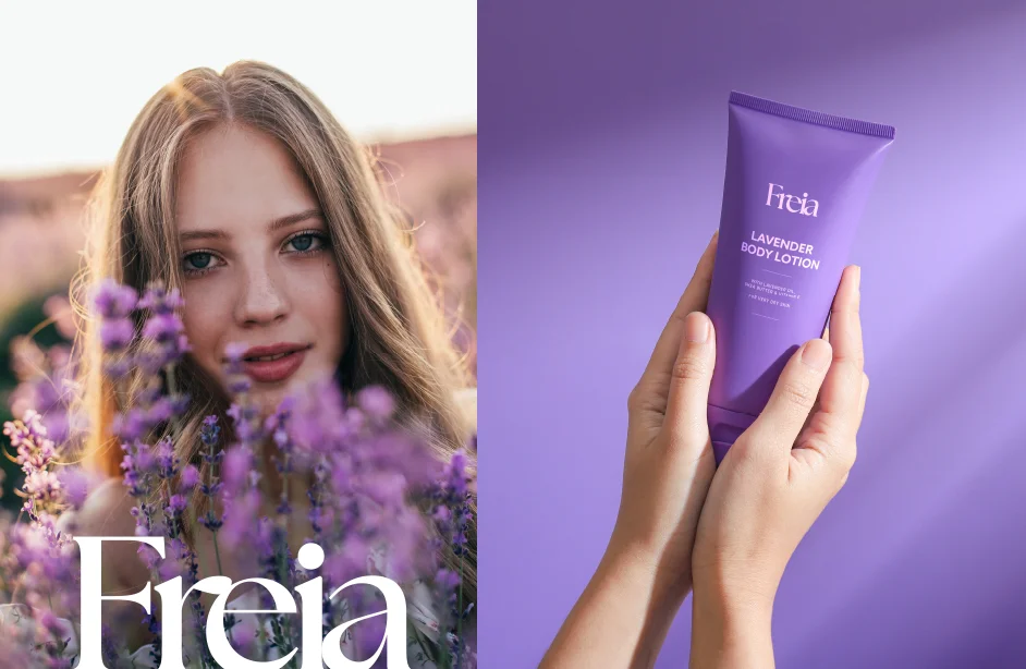
Logo and branding design for the cosmetic brand Freia was created as a visual concept focused on aesthetics, consistency, and the character of a beauty brand. The main goal was to develop a visual identity that combines elegance with naturalness and subtle femininity. The Freia logo is based on classic typography, giving the brand both a luxurious and distinctive feel. The overall design is complemented by botanical illustrations and a color palette inspired by nature — shades of green, purples, and warm, organic tones commonly used in cosmetic brand design.
The project includes a concept for a cosmetic brand visual identity: logo, color palette, typography, and example applications across packaging and visual materials. The entire system was designed to be cohesive, presenting a clear artistic direction and the potential for building a strong beauty brand image. This is a conceptual cosmetic branding project that showcases an approach to logo and visual identity design in the beauty industry — with a focus on detail, aesthetics, and clear visual communication.