Packaging Innovations – Visual Identity for the Packaging Industry Trade Fair
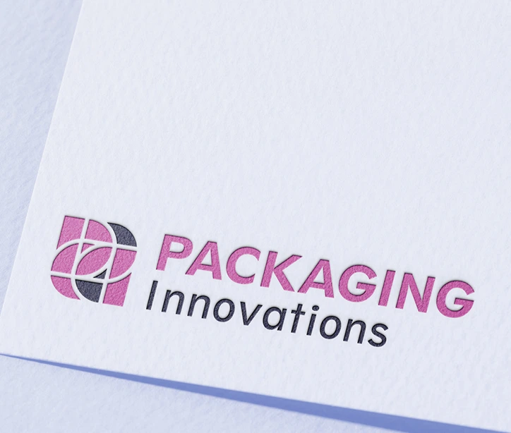
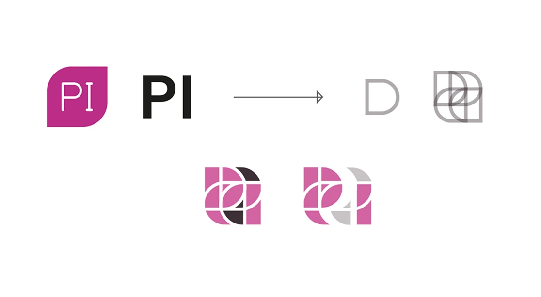
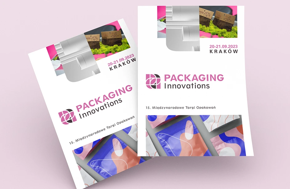
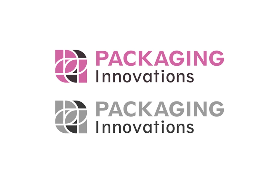
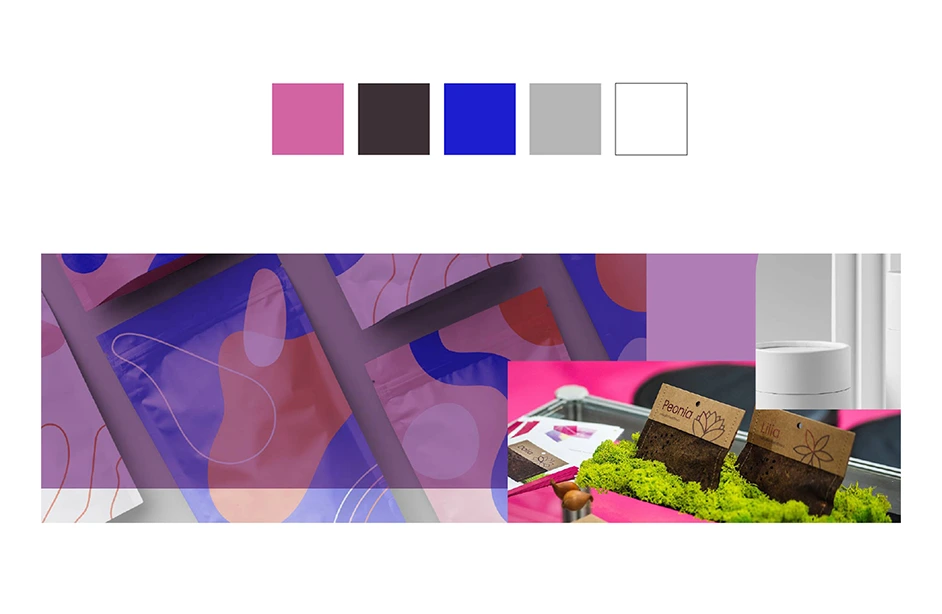
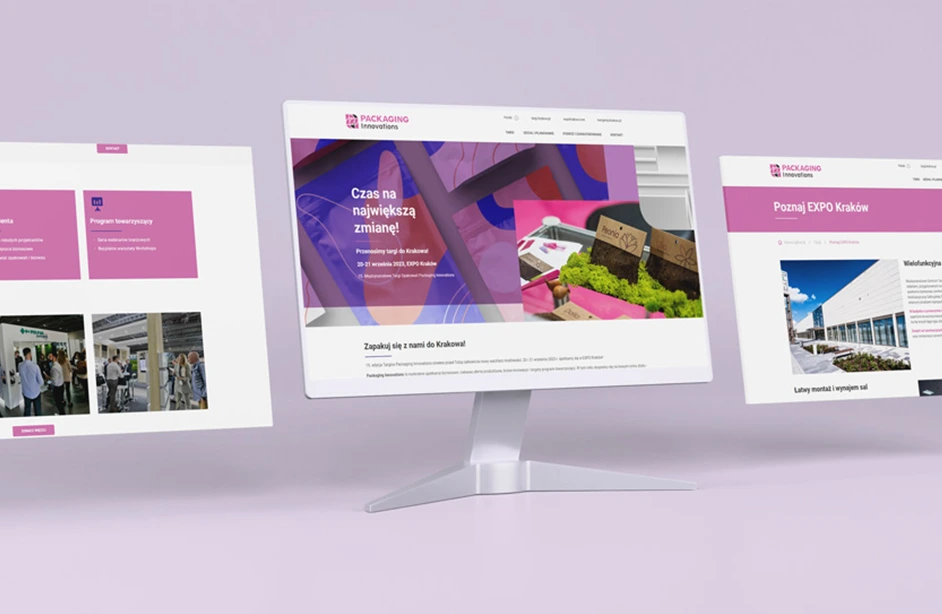
The visual identity project for Packaging Innovations — an international trade fair for the packaging industry — is a modern, modular graphic system that highlights the innovative and technological nature of the event while remaining clear and user-friendly. The starting point for the visual system was a logo based on the abbreviation “PI” and a geometric symbol (the previous trade fair logo). The symmetrical shape of the symbol, its rotation, and compositional arrangement symbolize movement, development, and exchange — values that define the fair as a platform for industry meetings. Its modular form also resembles a die-cut cardboard packaging shape. The color scheme relies on dynamic shades of purple, pink, and gray, creating a modern and professional image of the event while giving it visual freshness and consistency in communication. The project included the creation of a full set of identity elements: the main logo and its variants, color palette, key visual, promotional materials (print and digital), as well as website layouts. The entire system was designed with flexible use across various media in mind — from booth identification, catalogs, to online communication. The result is a consistent and modern visual identity that supports Packaging Innovations’ recognition as one of the key packaging sector trade fairs in Europe.