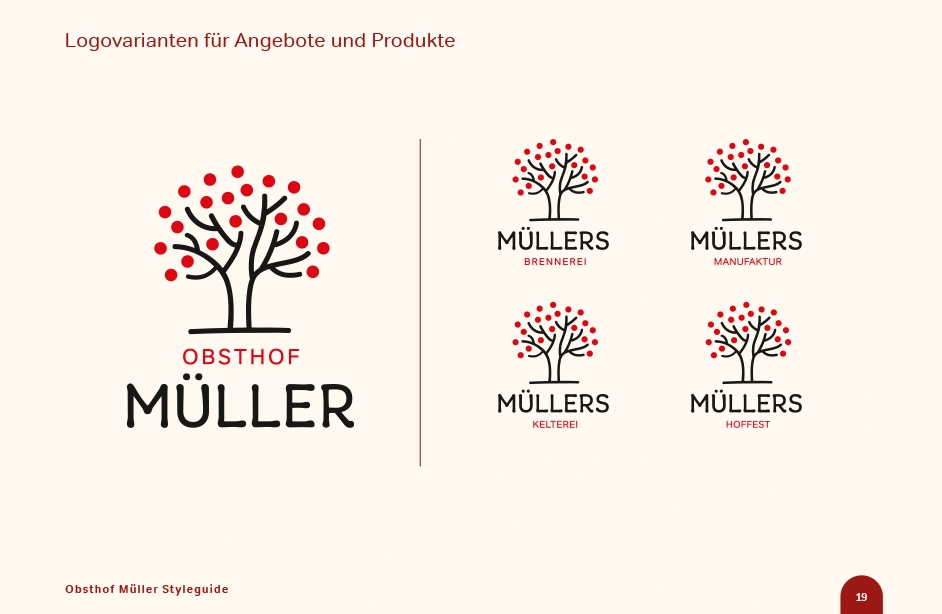
Logo and Visual Identity for a Family-Owned Orchard
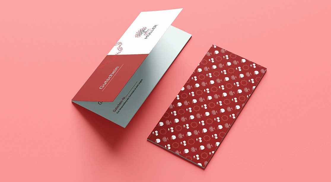
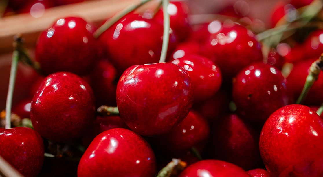
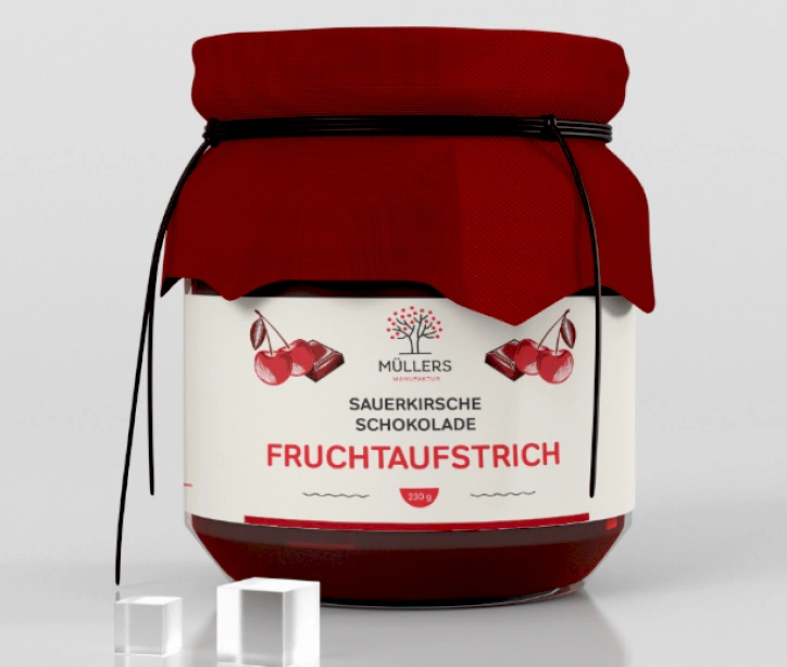
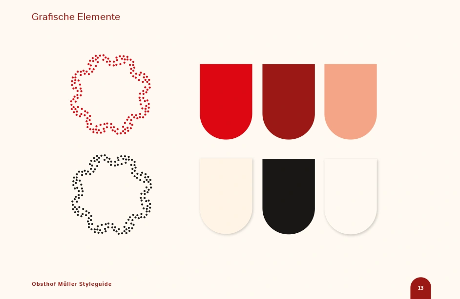
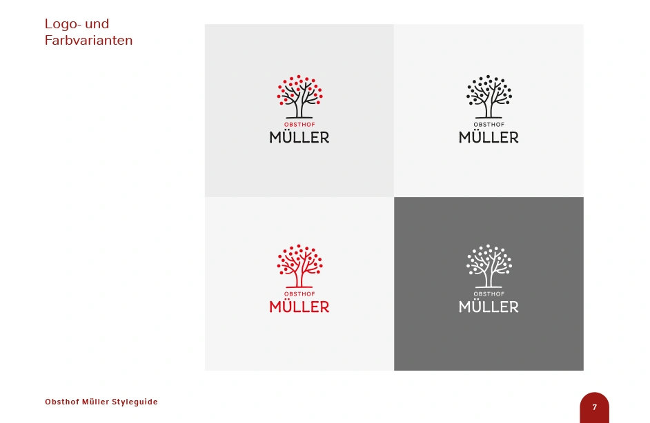
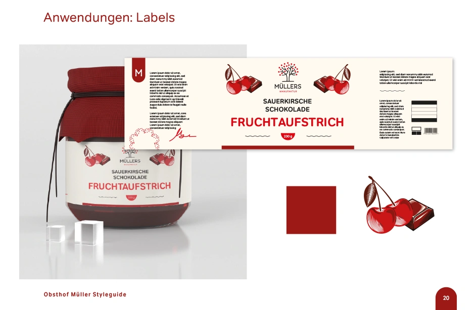
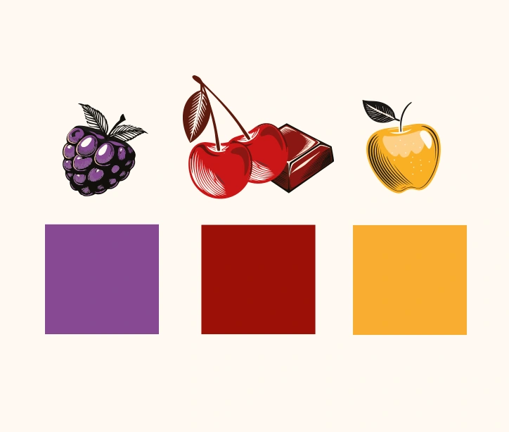
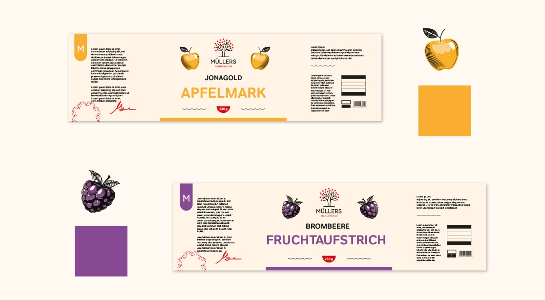
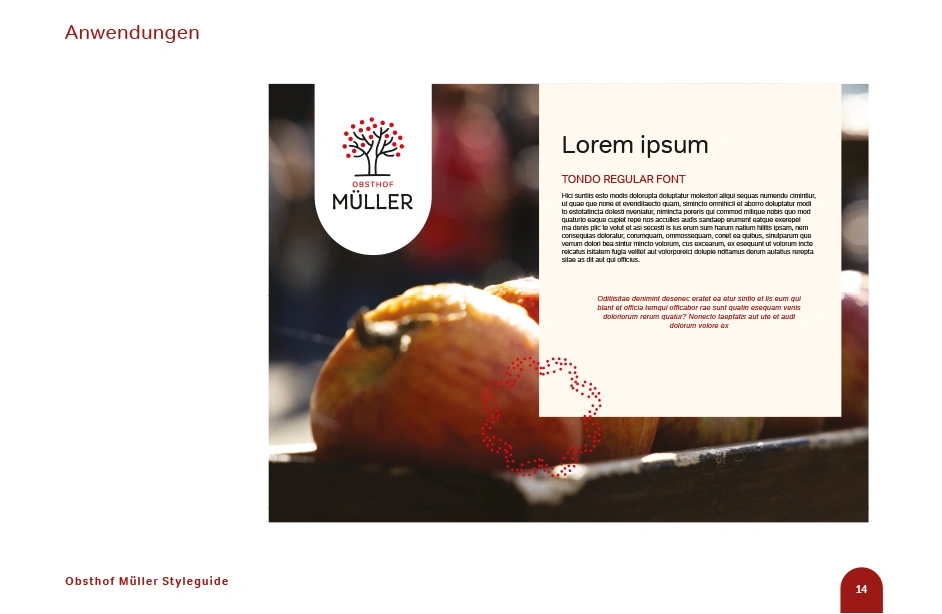
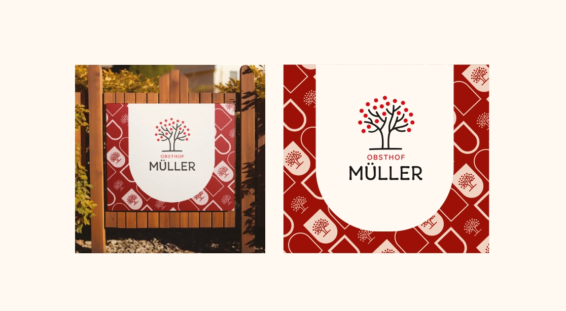
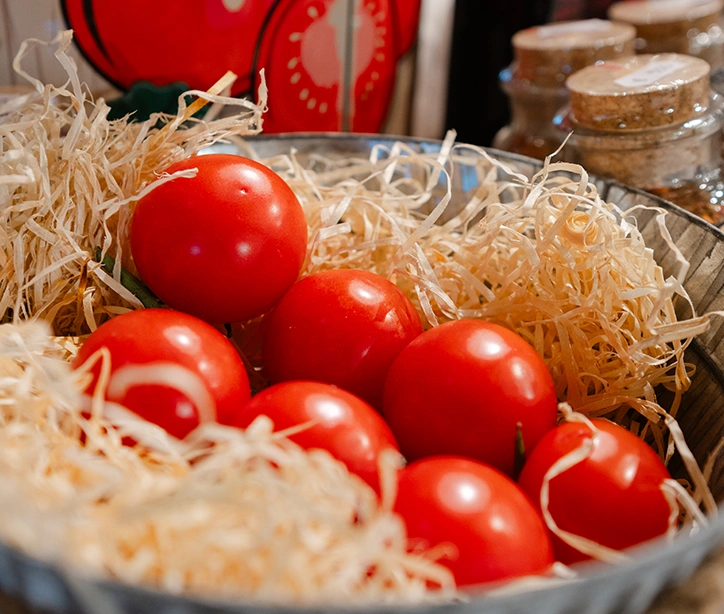
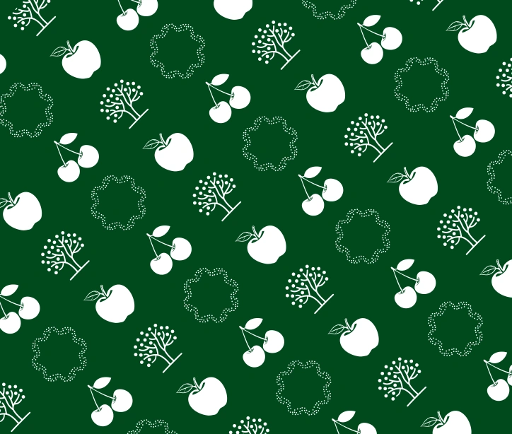
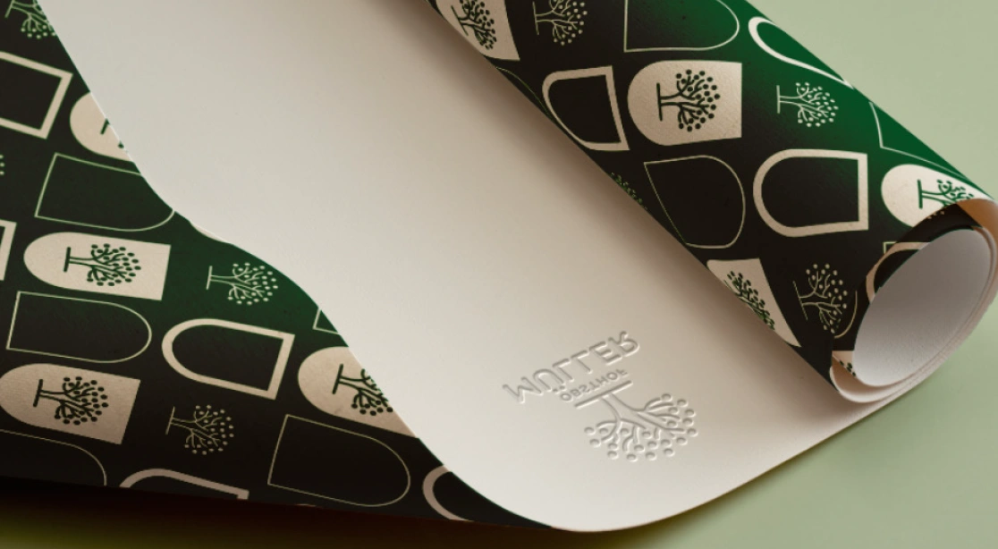
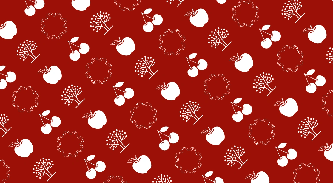
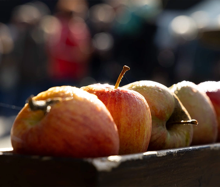
The visual identity project for Obsthof Müller – a family-run fruit orchard in Germany – combines modern design with the natural character of the brand. The main goal was to create a cohesive and recognizable visual system that conveys freshness, quality, and the tradition of fruit cultivation. At the heart of the concept is a logo featuring a simplified fruit tree symbol. The color palette is inspired by the natural hues of ripe fruit – from deep cherry red and creamy beige to neutral blacks and greens. The identity is complemented by graphic patterns that appear across packaging and printed materials, such as labels, business cards, and promotional content, as well as custom iconography. Altogether, the visual concept aims to build a friendly yet professional brand image.